
Style guides
One Room, Five Interior Design Styles: Compare Before You Redesign
See Scandinavian, Japandi, warm minimalism, mid-century and contemporary ideas in one room, then choose the details worth testing.
You can like a style in a photograph and still dislike it in your own room. The window, the furniture you keep and the amount of visible floor all change how a palette feels. Comparing five directions on one starting image brings those preferences into a more useful context.
This guide uses the same living room for five AI-generated concepts. They are interpretations of styles, not strict definitions. Look for what changes your response: the sofa color, the darkness of the timber, the rug pattern or the addition of another chair. Those observations become a better brief for your next version.
Start with one room and one decision
A style comparison works when the room stays recognizable. Use a photograph that shows the window, the main furniture arrangement and enough floor to read the space. Keep that image as the source for every initial direction. If you generate one style from the previous style, you are comparing a chain of revisions rather than five interpretations of the same starting point.
Our reference has a sofa on the left, a radiator beneath the rear window and a media unit on the right. Those are the anchors requested in each brief. Furniture finishes, shapes, textiles and accessories can change. This makes the exercise a broad design exploration; it is deliberately different from testing just one paint or cabinet color.
Give every style the same boundaries
Write the fixed conditions before the style name: preserve the viewpoint, window, radiator and recognizable room proportions. Then describe what the style means to you in concrete materials and colors. Words such as Japandi or contemporary leave plenty of room for interpretation. A charcoal sofa with smoked oak is more specific than simply asking for a calm room.
Do not expect those boundaries to lock the image perfectly. Compare window divisions, cabinet position and usable floor area after generation. A more attractive picture may also contain a larger room, new furniture or different light. Keep a note of those changes so they do not quietly become reasons to prefer one style.
Scandinavian: light wood with blue and yellow
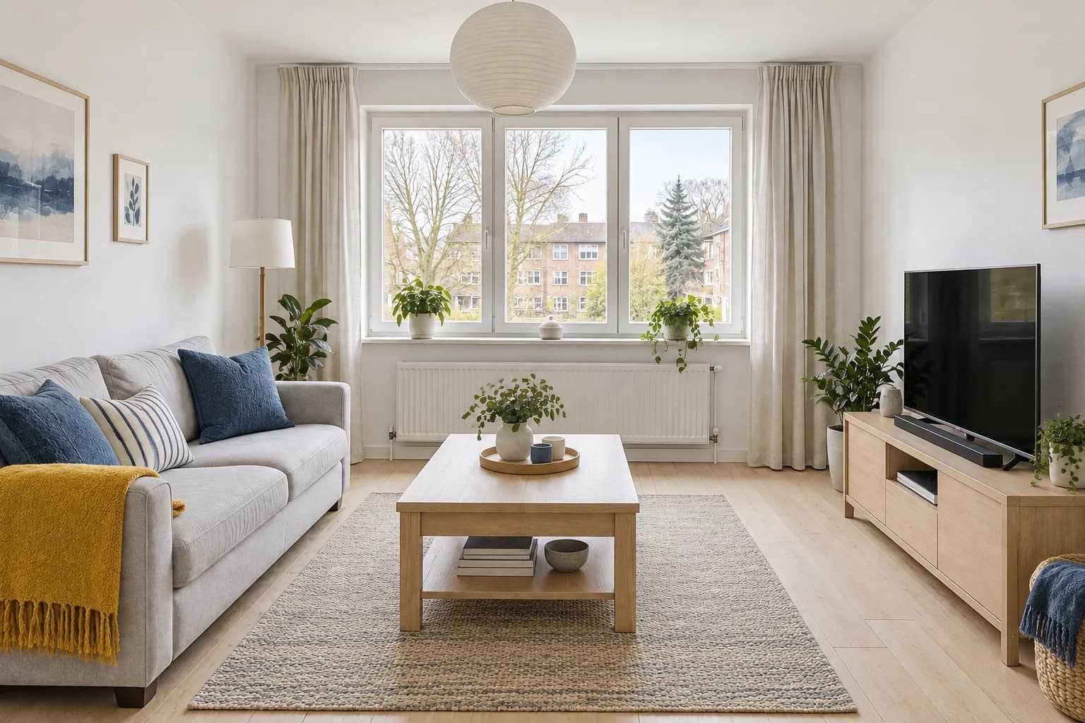
This direction keeps the largest surfaces light and puts color into things you can move. The blue cushions give the grey sofa a clear identity, while the mustard throw creates a warmer point of contrast. Pale wood connects the coffee table and media unit without making both pieces disappear against the floor. It is a useful starting point if you want an easygoing room with distinct accents rather than a completely neutral scheme.
Look at the table and floor together. When their wood tones are very similar, their shapes matter more than their color. In a real room, take a sample beside the furniture you already own. You can borrow the blue-and-yellow textile idea without replacing every wood finish. The result also introduces extra plants and a different pendant: those belong to the styling concept, not to the original room.
Choose this if your priority is a bright background and color you can change through textiles.
Japandi: charcoal, smoked wood and rust
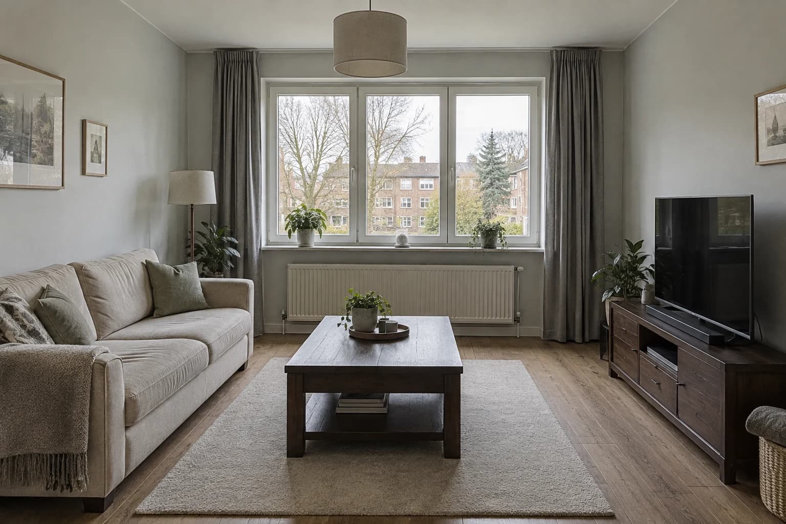
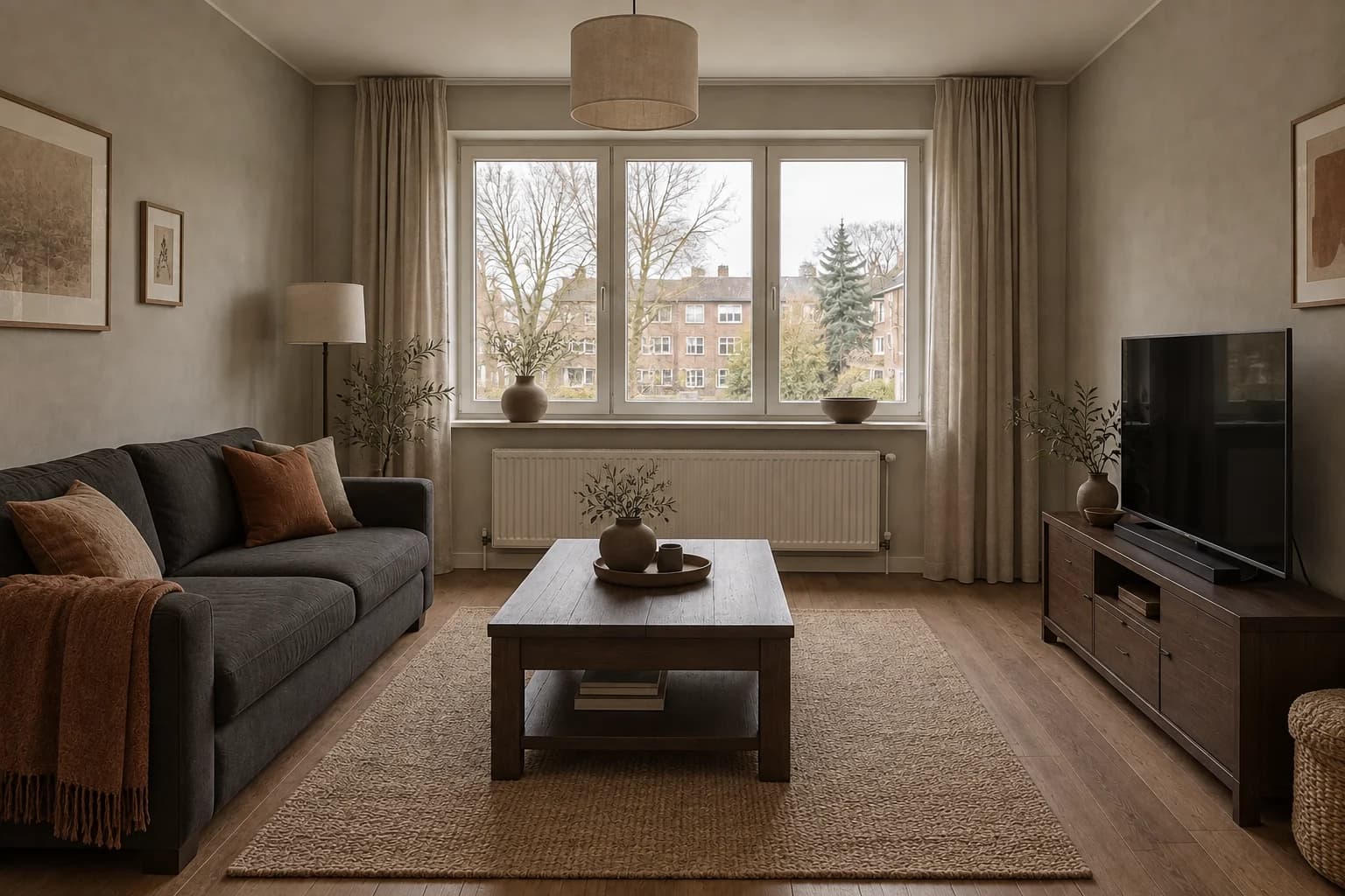
This interpretation puts depth ahead of brightness. The charcoal sofa and dark table create a low, grounded band across the room, while the warm grey walls soften the contrast around the window. Rust cushions prevent the muted palette from becoming flat. The aim is a restrained relationship between surfaces, shapes and empty space, rather than a shopping list of objects associated with a label.
The image is visibly dimmer than the Scandinavian version. Separate that lighting difference from your preference for the furniture. You may like charcoal upholstery but still want the lighter walls and daylight of another option. Check whether the low table would suit the way you sit and whether the darker cabinet would make the television corner too heavy. Neither comfort nor room measurements can be read reliably from the concept.
Choose this if you prefer quieter color, darker timber and fewer competing focal points.
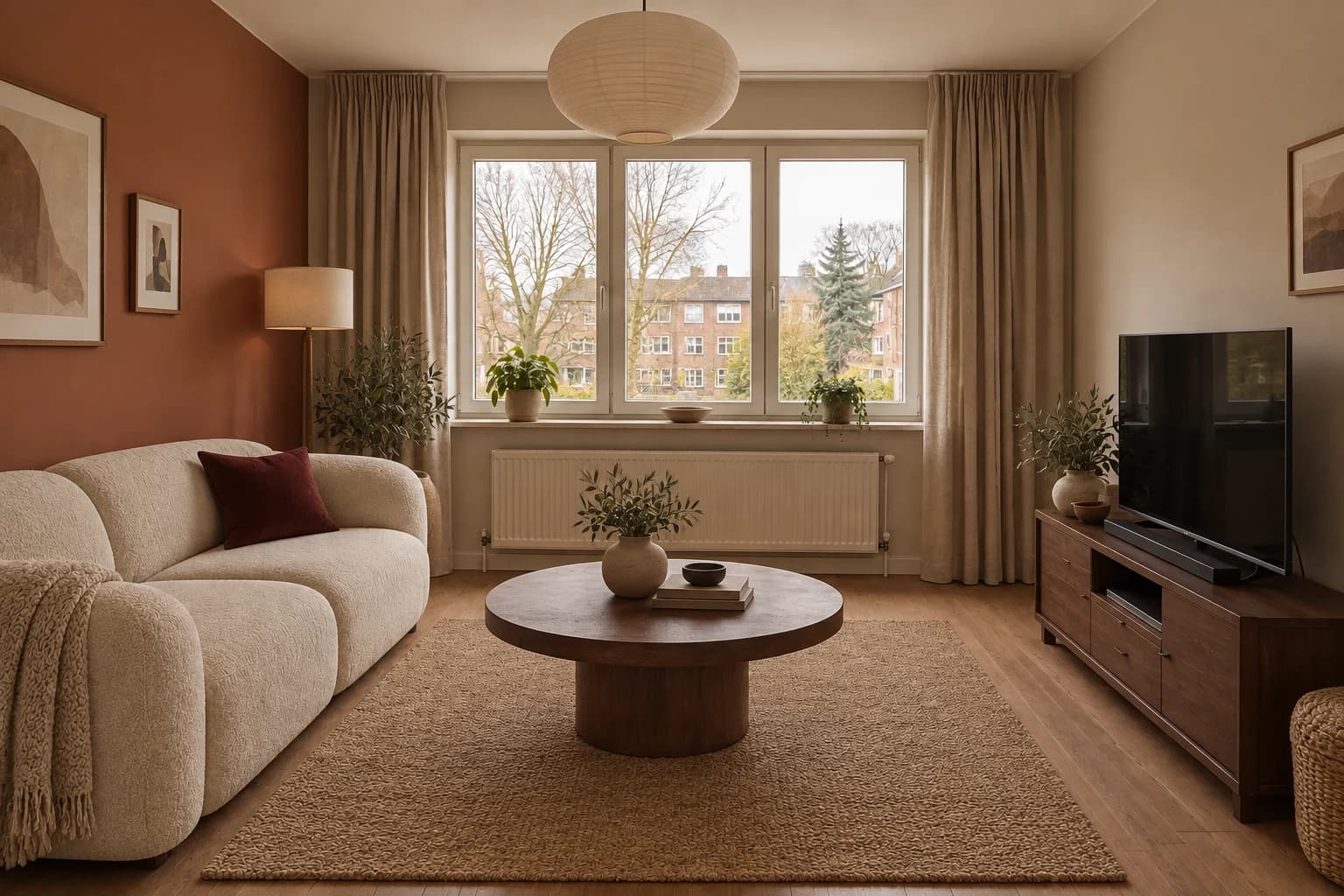
Warm minimalism: terracotta and sculptural cream
Warm minimalism does not have to mean beige on every surface. Here the terracotta wall carries most of the color, allowing the cream sofa and rounded table to remain simple. A burgundy cushion adds a smaller, deeper note. The sofa silhouette and circular table change the rhythm of the reference room more than a set of decorative accessories would.
Notice that this is a broader redesign, not a paint-only edit. The table changes shape, the upholstery changes and the room gains a softer pendant. If you like the wall but plan to retain your existing sofa, test that single change separately. A color that looks balanced behind cream upholstery may feel different behind your current grey, brown or patterned sofa.
Choose this if you want one warm architectural color and furniture with softer outlines.
Mid-century modern: teal, walnut and orange
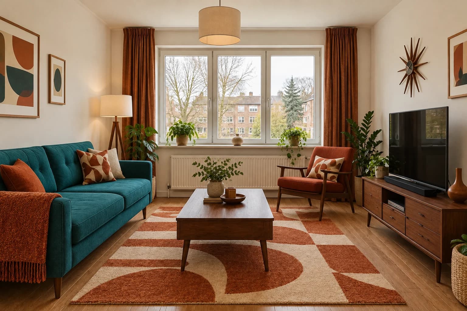
The teal sofa and orange chair make this the most obviously warm-and-cool pairing in the group. Walnut furniture links the seating pieces, and the geometric rug repeats their colors at floor level. The room feels more furnished than the quieter versions because the chair introduces another destination near the window. That can be appealing, but it is also an additional spatial commitment.
The orange chair partly sits in front of the radiator zone even though the brief asked to keep it clear. That is a concrete reason to review circulation and heat sources before taking the arrangement further. You can keep the teal-and-walnut direction while dropping the chair or simplifying the rug. A strong style image is often most useful as a source of two or three decisions, not an arrangement to copy wholesale.
Choose this if you enjoy expressive upholstery and visible wood furniture, then verify the extra chair fits.
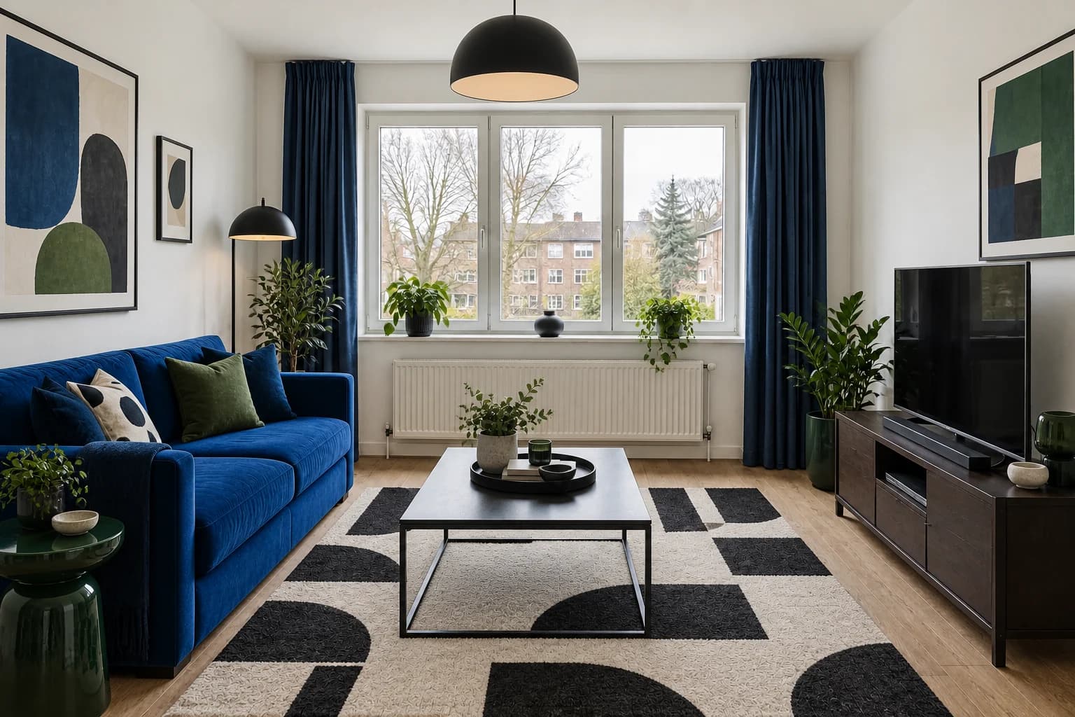
Contemporary: cobalt, black and graphic contrast
This direction uses clear blocks of color and a sharper contrast between dark details and light walls. The cobalt sofa becomes the anchor. Green side tables and cushions introduce a second cool color, while the large graphic rug gives the center of the room a strong pattern. It is a useful counterpoint to the rust and timber in the other versions.
Judge the rug from the doorway view, not only as a close-up. Its pattern occupies a large part of the visible floor, so a small sample can understate its effect. The side tables and artwork are also additions; keeping your current furniture would produce a different balance. If the whole concept feels too busy, retain the sofa color and make the rug quieter before dismissing the direction.
Choose this if you like saturated color and a crisp contrast between furniture, art and background.
Choose the ingredients, not just the label
After looking at all five, name the two elements you would actually bring into your room. This is more revealing than voting for a whole image. You may choose the Scandinavian wood tones and the contemporary sofa color, or the mid-century walnut and the quieter Japandi textiles. A mixed preference is useful information, not a failure to find your style.
Limit the next round to two concepts. Give both the same lighting request and remove additions you cannot accommodate. If one option depends on buying five new pieces and another works with your existing sofa, record that difference before comparing their appeal. You are choosing a direction for your circumstances, not selecting a winner for a magazine cover.
| Style direction | Visible ingredients | When to explore it |
|---|---|---|
| Scandinavian | Pale wood furniture, a grey sofa and blue textiles with a mustard throw. | Choose this if your priority is a bright background and color you can change through textiles. |
| Japandi | Charcoal upholstery, dark wood furniture, warm grey walls and rust accents. | Choose this if you prefer quieter color, darker timber and fewer competing focal points. |
| Warm minimalism | A terracotta wall behind a rounded cream sofa, with a walnut table and burgundy cushion. | Choose this if you want one warm architectural color and furniture with softer outlines. |
| Mid-century modern | A teal sofa, walnut furniture, orange armchair and geometric rust rug. | Choose this if you enjoy expressive upholstery and visible wood furniture, then verify the extra chair fits. |
| Contemporary | A cobalt sofa, dark curtains, black-and-white rug and green side tables. | Choose this if you like saturated color and a crisp contrast between furniture, art and background. |
Turn a favorite into a smaller experiment
Return to your original photograph when you want to test a single borrowed ingredient. For example, ask for a teal sofa while keeping the existing rug and curtains. That makes it easier to see whether you liked the color itself or the entire styled setting around it. Save the broader concept separately as a reference for mood.
If you are refining the whole scheme, start from the selected result and describe only the changes. Keep the teal sofa and walnut table; simplify the geometric rug; remove the extra chair. Review those requests against the output one by one. Avoid adding several new style labels to a revision because they can reopen decisions you had already made.
Before shopping, translate the visual idea into actual materials: an upholstery sample, a wood finish and a paint sample viewed together in the room. The image establishes a relationship between colors. The samples tell you whether the available products create that relationship in your daylight.
Questions about comparing interior styles
Can I mix two styles?
Yes. Start with shared materials or shapes rather than collecting every signature element. A walnut table can connect a quieter room with a mid-century influence. Keep one dominant palette so the combination has a clear center.
Which style makes a small room feel larger?
A concept cannot prove spaciousness. Compare visible floor, furniture bulk and contrast, then check the actual dimensions. In these examples, an extra chair changes the usable arrangement more than the name of the style does.
Why did the light change between versions?
An image model may reinterpret lighting as part of a style. Treat a brighter window or darker room as a separate change. Request consistent daylight in your next round before deciding between close alternatives.
Do I have to replace all my furniture?
No. Use the five directions to identify one or two changes worth testing with the pieces you plan to retain. A focused follow-up can be more relevant than a complete redesign.