We use analytics cookies to understand traffic and improve Vizterior. They load only if you accept—declining won't limit the site in any way. See our Privacy Policy.
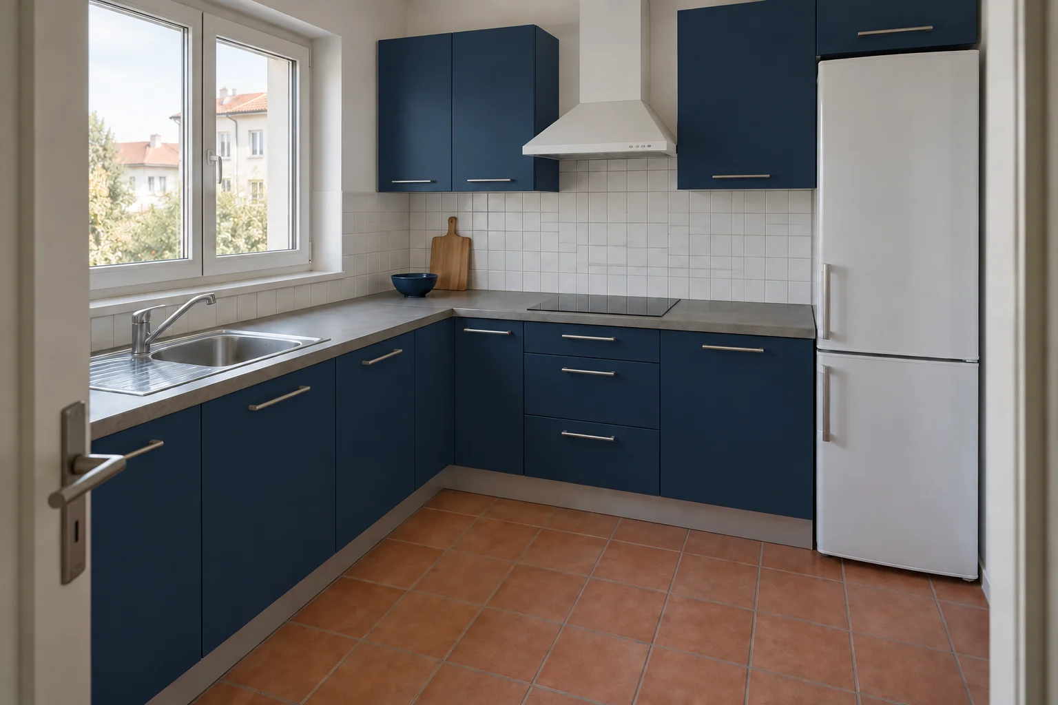
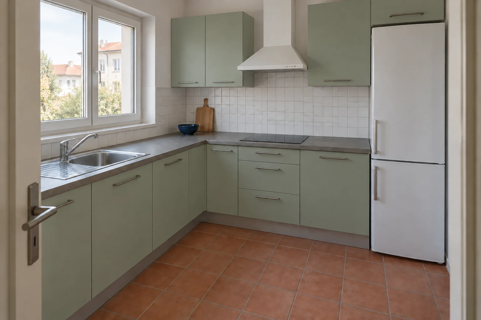
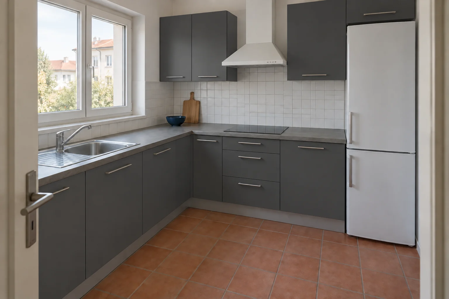
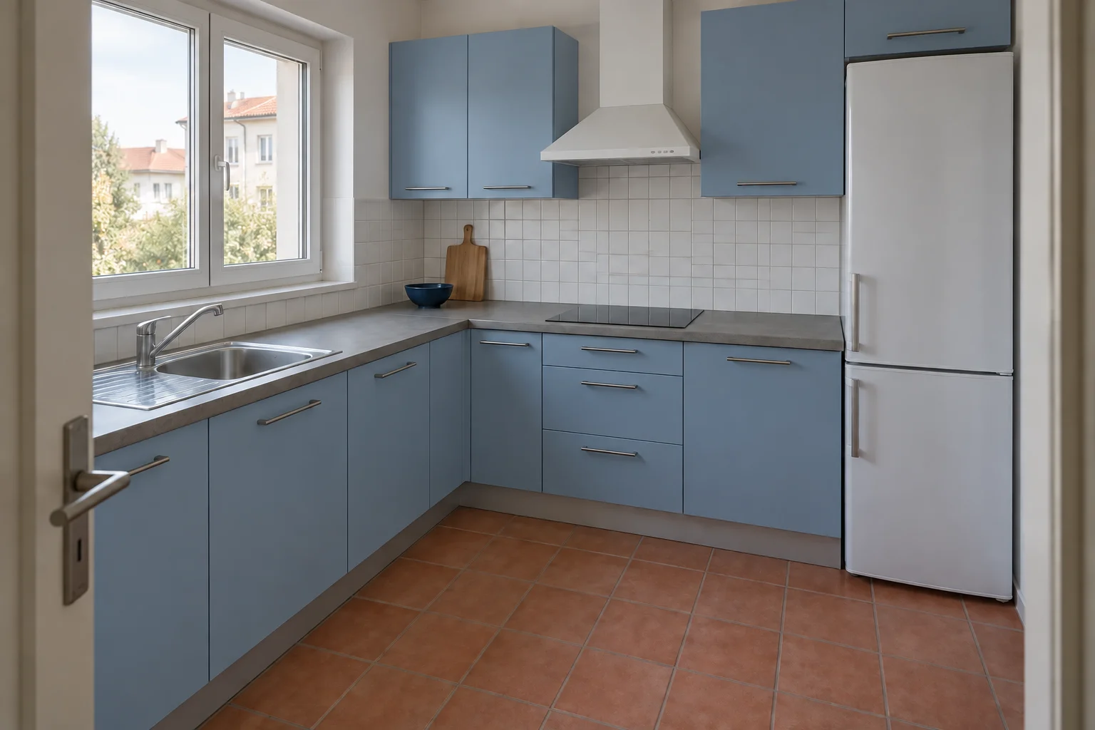
Navy / a deeper contrastSage / a softer directionCharcoal / a graphic edgeMuted blue / a cooler palette
01 / Keep the context
A finish never lives on its own.
A cabinet color can look perfect on a sample and feel completely different beside the floor, wall and worktop. A material visualizer helps you explore that relationship before narrowing down the options. Start from one readable room photo so each proposal has the same point of reference.
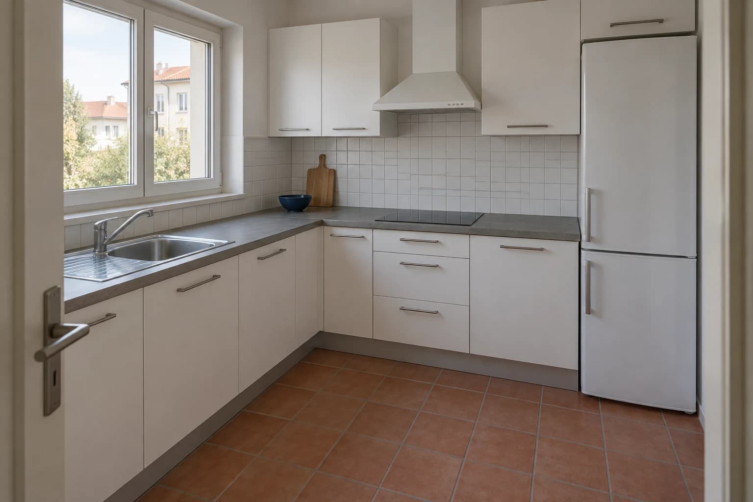
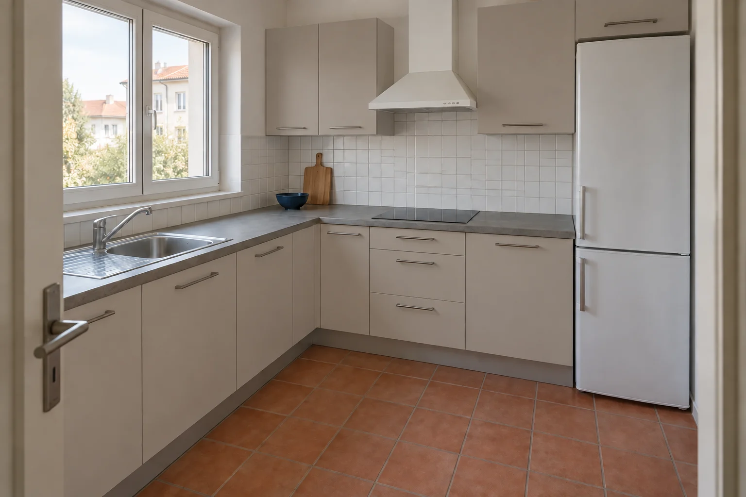
The four cabinet studies above begin with this kitchen. Compare the fronts against the existing terracotta floor and daylight, rather than treating each image as an isolated moodboard. Notice how a darker color changes the visual weight of the whole run of cabinetry.
The starting kitchenA quieter greige alternative
02 / Look below the furniture
Three floors. Three different foundations.
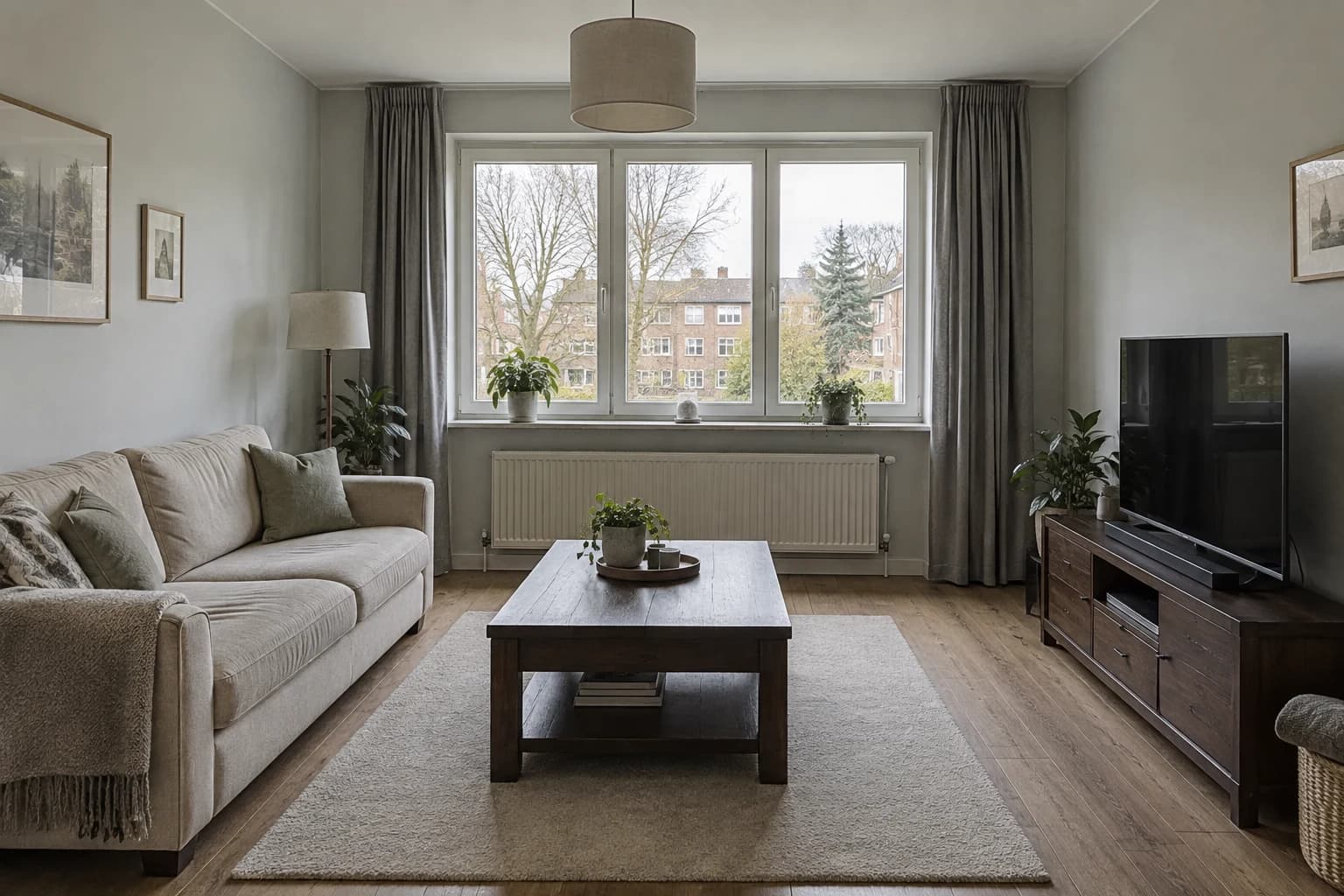
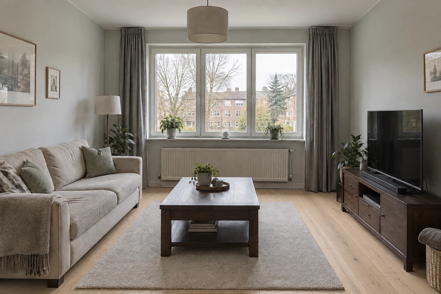
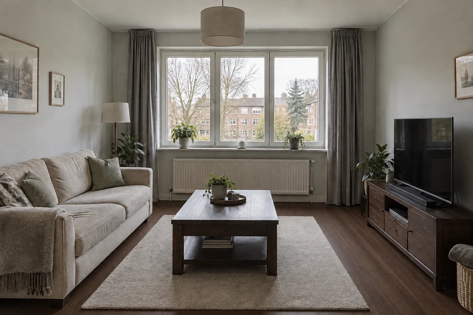
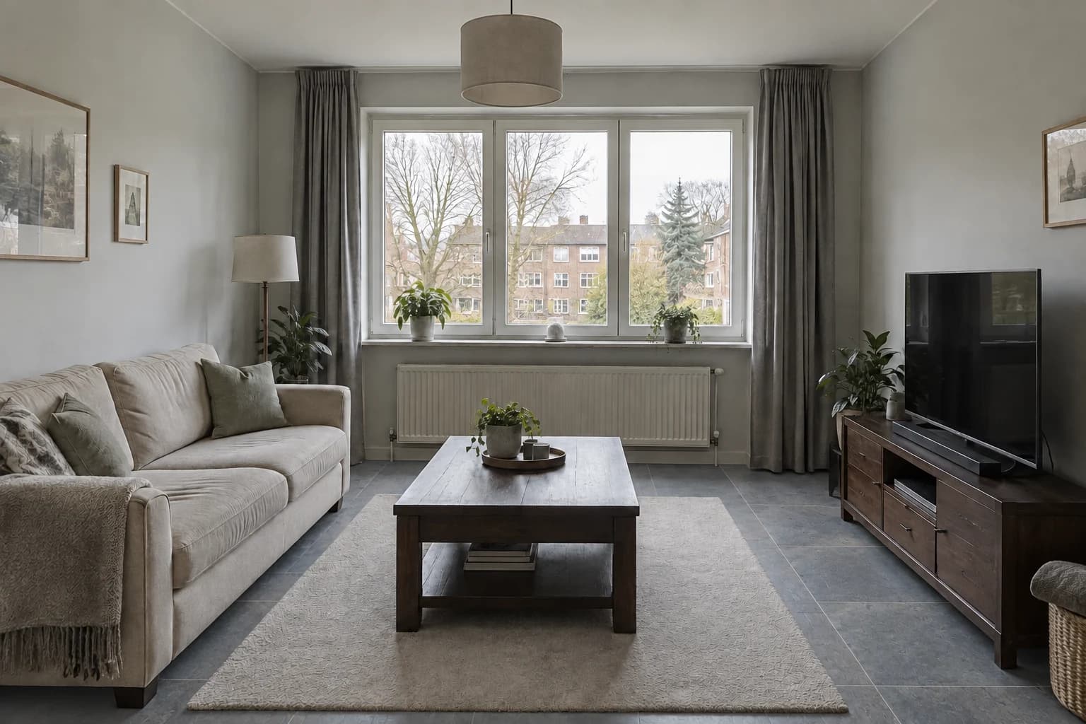
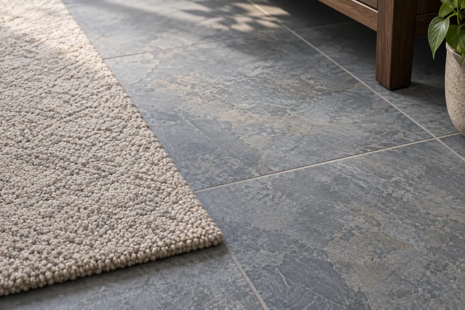
Flooring occupies a large part of the image, so its color and pattern can change how every other finish reads. Pale oak brings a lighter base, darker wood adds depth, and a slate-look surface introduces a cooler, more mineral character.
Use the same room view to compare alternatives. Look at the contrast with the sofa and storage, the direction of the pattern and how busy the surface feels across the full floor. A generated texture suggests a visual direction; it does not establish plank dimensions, slip resistance or installation details.
Original room and floorLight oakDark wood-look vinylSlate-look tile
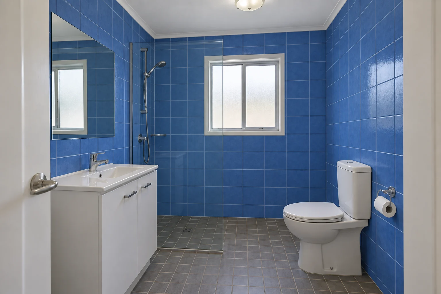
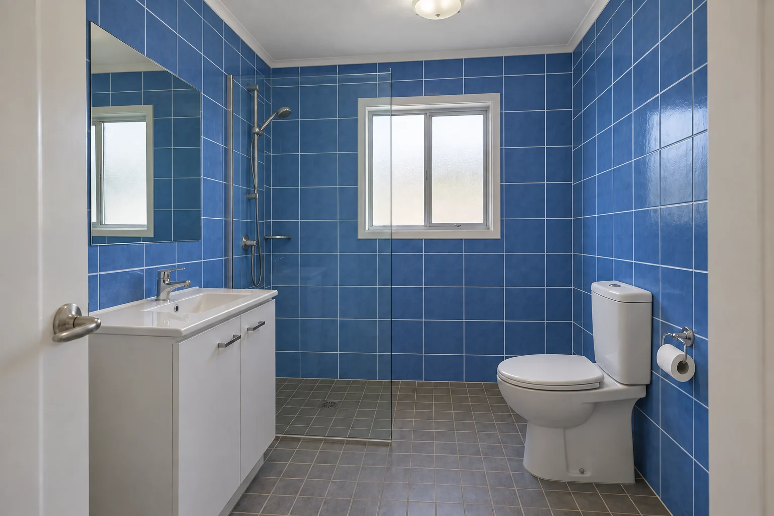
A bathroom palette is about more than a favorite tile. Wall color, grout contrast and the vanity all affect whether the room feels quiet or expressive. Compare a more continuous treatment with a contrasting floor, and keep the sanitary fixtures as reference points.
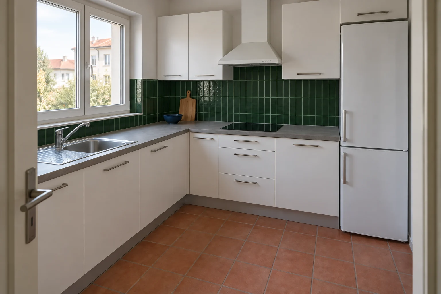
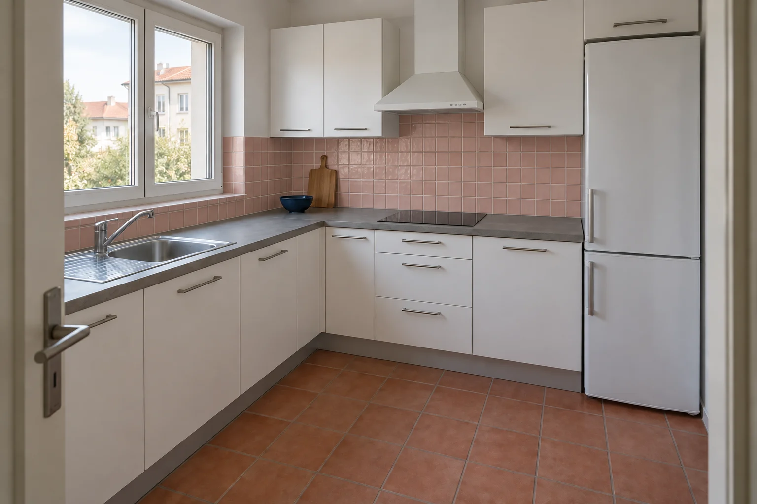
In a kitchen, even a smaller splashback can redirect the palette. A green tile can connect with timber, while a clay tone can echo an existing warm floor. Ask for one surface change first so you can see what it contributes.
A more continuous bathroom paletteA contrasting floorGreen kitchen tileClay-toned kitchen tile
04 / One decision at a time
Start with the surface you are choosing.
Name the surface, the visual finish and the parts that should remain. ‘Change the lower cabinet fronts to matte navy’ is easier to evaluate than ‘make the kitchen better’. Once that direction works, continue with a separate worktop or hardware study.
Check each result against its starting image. AI can introduce changes beyond the requested surface, including lighting or nearby objects. If the comparison becomes hard to judge, return to the earlier result and narrow the instruction.
Choose one surface and one visual goal.
Compare it with the adjacent finishes.
Check the room again before choosing the next edit.
An instruction you can adapt
Change the cabinet fronts to matte navy. Keep the worktop, splashback, terracotta floor, appliance positions and camera viewpoint as consistent as possible. Do not add an island.
From concept to a considered choice
Take the direction into the real light.
Use the strongest images to narrow your sample shortlist or explain a preference to a designer. Then look at real samples together, in the room and at different times of day. Screen color, generated reflections and texture scale can differ from the actual product.
Keep a whole-room view alongside any close-up. A finish that looks interesting in detail may dominate the room at full scale. The useful outcome is a clearer comparison and a more specific next conversation.
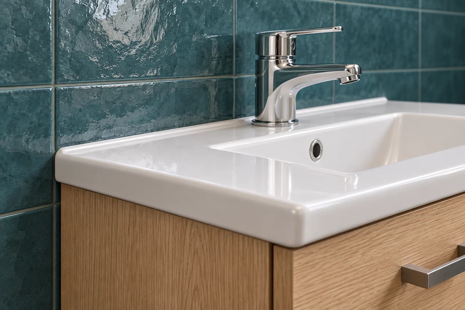
Read the surface in detailCompare texture and adjacent finishes
Good to know
A few questions before you start.
Can I change only one surface?+
Describe the surface explicitly and ask to retain the surrounding room. You can start with a room photo or continue from a successful result. AI may still change nearby details, so check the result against the source rather than assuming the edit was perfectly isolated.
Will I see an exact paint or tile product?+
These are visual concepts, not calibrated product previews. A generated color or texture is not an exact match to a manufacturer’s sample. Use the image to narrow a direction and verify the product, color and finish physically.
Can I compare flooring materials?+
Yes. Describe the look you want, such as light oak, darker wood-look vinyl or slate-look tile. Keep the room and viewpoint consistent in the instruction, and compare the floor with the surrounding furniture and light.
Do I need a separate material tool?+
Material studies use a room redesign or a focused follow-up instruction in Vizterior. Start with your photo, name the surface and describe the finish. The prepared comparisons on this page are examples, not a live product configurator.
Can I try several changes at once?+
You can describe a full palette, but it can be harder to tell which change improved the room. When comparing finishes, begin with one major surface and move to the next after selecting a useful direction.
What should I do if the layout changes?+
Return to the original photo or a previous result and name the architectural elements that matter. Keep the request focused. Compare openings, cabinetry and perspective before judging the new finish.