
Materials & color
Flooring Visualizer: How to Compare Floors in Your Own Room
Compare light oak, dark walnut-look vinyl and slate-look tile in one room, then narrow the choice with real samples.
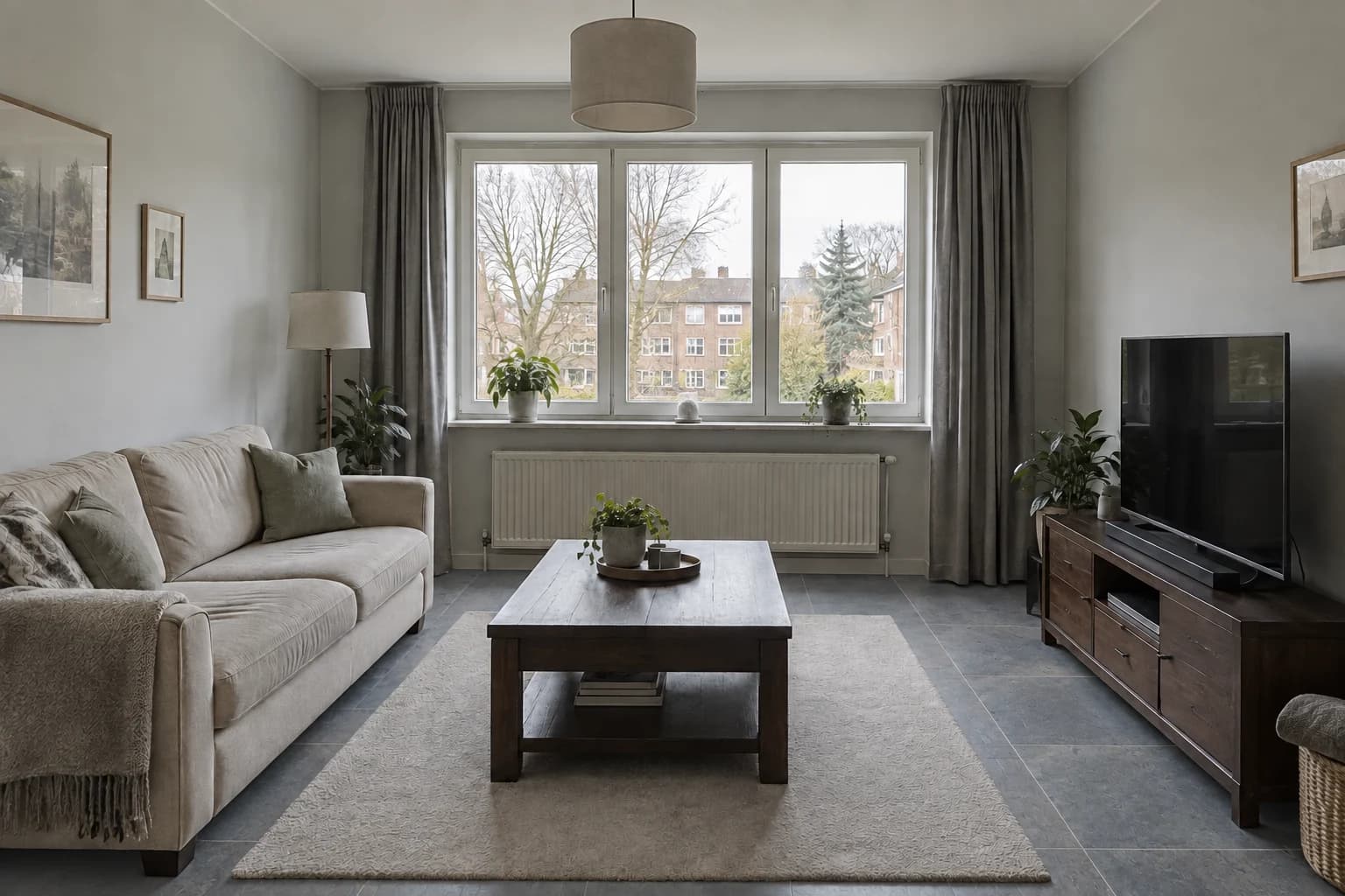
A floor sample is small; the decision covers most of a room. A flooring visualizer helps you see how a light, dark or tiled surface relates to the furniture and finishes around it. The useful first question is which visual direction belongs in your room, before you choose a specific product.
Here we compare three AI-generated flooring concepts from one living-room image. The furniture and rug remain part of the brief, so you can focus on the exposed floor. Use the comparison to build a shortlist, then check appearance and suitability with real samples and product specifications.
Show enough floor to make the comparison useful
Choose a level room photograph with a visible floor area in the foreground and along at least one wall. A tightly cropped picture of a sofa may leave too little flooring to compare. Keep the camera angle consistent across options: a lower viewpoint exposes a different proportion of floor and can change your reaction even when the material is similar.
Our reference keeps the existing rug in place because it is part of the room we are evaluating. That leaves a visible border around it, particularly beside the media cabinet. If you intend to keep a large rug, this is a realistic question: how does the new floor frame it? If you plan to remove the rug, take another reference photograph without it before comparing the materials.
Write down the fixed finishes, especially skirting, doors, cabinetry and furniture with visible timber. A floor may work with the sofa but clash with a wood cabinet that the model has helpfully recolored. Asking to keep those elements gives you a more useful comparison, even though you still need to review the result.
Compare three visual directions before product details
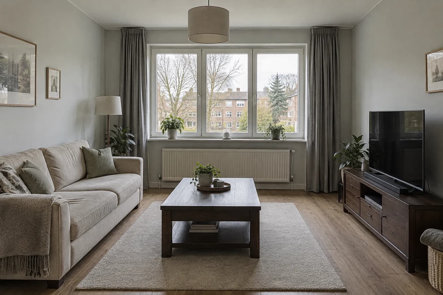
This comparison uses light oak, dark walnut-look vinyl and blue-grey slate-look tile. They differ in brightness, color and surface pattern, so the first round helps you choose the overall relationship with the room. It is not a technical ranking of wood, vinyl and ceramic. A generated image shows an interpretation of their appearance, not their construction or performance.
Each version starts from the same photograph and asks to change only the visible flooring. The furniture, rug, curtains, window and lighting are retained in the brief. That narrower scope makes the differences easier to read than a full redesign in which everything changes at once.
| Visual direction | What changes in the image | Check beyond the image |
|---|---|---|
| Light oak | A lighter warm border around the rug | Compare grain and tone on real samples |
| Walnut-look vinyl | A darker timber appearance | Confirm product construction and suitability |
| Slate-look tile | A cooler field with visible joints | Confirm tile format, grout and laying plan |
Light oak: a brighter frame around the rug
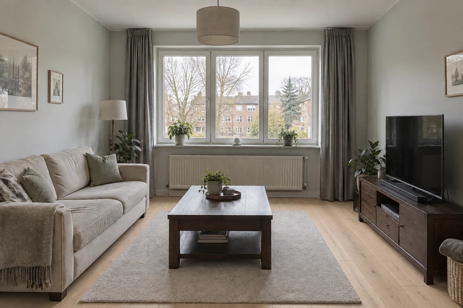
The light oak direction creates a pale band between the rug and the walls. Beside the dark media cabinet, that difference makes the cabinet’s edge clearer. The floor still has a warm timber character, so it does not simply become another grey surface alongside the walls and curtains. This is the lightest of the three options.
Look at the visible strip on the right rather than only the foreground. It shows how the floor relates to the cabinet across a longer run. The planks are a visual interpretation; their apparent width and joins should not become a specification. If you like the general tone, compare actual oak or oak-look samples for grain, variation and finish.
This option does not prove the room will be brighter by a measurable amount. Exposure and surface rendering can change during generation. Treat the image as a way to judge visual contrast, then check the chosen sample in the actual room.
Walnut-look vinyl: a deeper timber direction
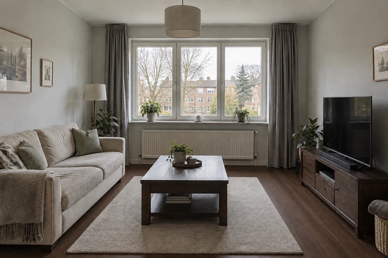
The walnut-look concept brings the floor closer to the dark furniture. The rug becomes a more distinct light shape, while the media cabinet blends more with the floor beneath it. This can make the palette feel more grounded, but it also changes how clearly the furniture silhouettes stand out. Compare that effect with the light oak version before deciding whether you want a darker floor.
The phrase vinyl describes the intended product category in the brief, not something the picture can authenticate. A photograph of a wood-look surface cannot establish its wear layer, construction, acoustic properties or suitability for your room. Use this image to shortlist a darker timber appearance; use product information to compare actual flooring options.
If the dark floor appeals but seems too close to the cabinet, test a slightly lighter brown before changing the cabinet itself. That keeps the decision about flooring and avoids turning a focused comparison into an unplanned furniture replacement.
Slate-look tile: cool color and a visible grid
The blue-grey tile direction moves the palette away from timber. The larger joints introduce a grid around the rug, and the floor relates more closely to the grey curtains and walls. The dark cabinet remains distinct, but the warm contrast present in the oak version is reduced. This is the clearest material-pattern change in the group.
Examine the grout lines where they meet the rug and the cabinet. Their visibility affects how busy the floor feels. A similar tile color with lighter grout would create a stronger grid; a closer grout color would make the surface read more continuously. The image can help you decide which effect to explore, while the actual tile format and laying plan need separate confirmation.
The reference rug hides much of the center of the floor. If your final room will have a smaller rug, compare a new source view before assuming this balance will hold. More exposed tile means more visible pattern.
Check texture after you choose light or dark
Start by comparing the light oak and dark timber images as whole rooms. Once you prefer a direction, look at surface variation and joint visibility. Trying to decide color, plank width, pattern and finish in one round makes it harder to understand why a result works.
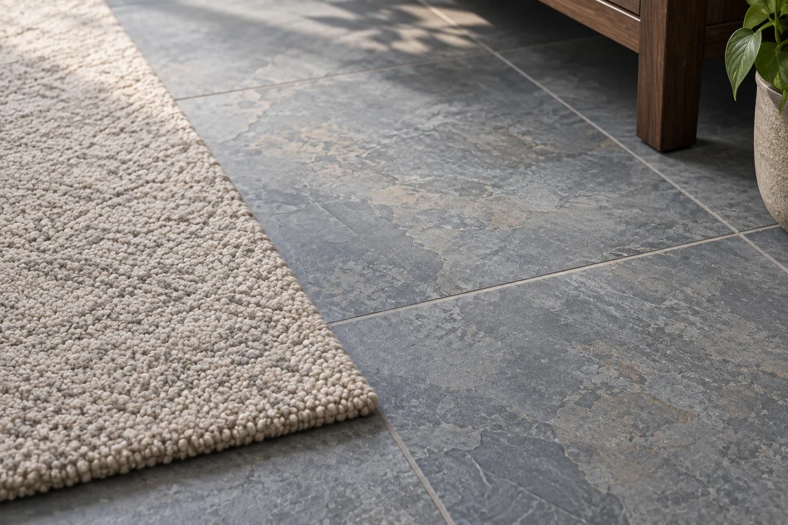
The detail study below explores the slate-look direction beside the rug. It makes the contrast between a textured floor and a softer textile easier to discuss. It is a generated material study, so do not use it to infer an exact tile edge, grout width or installation junction.
For a timber direction, the equivalent next question is whether you want quiet grain or stronger variation. For a tile direction, it is whether the joint should disappear or contribute to the pattern. Choose one of those questions for your next request, retaining the other decisions.
Compare real samples where the floor will be
Put shortlisted samples on the floor beside the furniture you plan to keep. View them from standing height and from your usual seat, not only close to your eyes. A small sample can make a dramatic grain look attractive without showing how often that pattern repeats across a room. Ask to see a larger display or several pieces when variation is part of the appeal.
Check the sample in daylight and under evening lighting. Include the threshold to the next room: a floor that works in one photograph still needs to meet neighboring surfaces in the actual home. Record whether you want continuity or a deliberate change at that boundary.
Then compare the practical specifications with the supplier and installer: intended room use, substrate requirements, overall build-up, transitions and the relevant maintenance instructions. An AI floor image cannot tell you whether a product is appropriate for that installation. Keep your chosen visual direction, but be prepared to find it in a different product if the first option does not suit the project.
Questions about floor visualizers
Can I compare wood, vinyl and tile from one photo?
Yes, as visual directions. Use the same photo and keep the room finishes stable. Do not use the images to rank durability, water resistance or comfort underfoot; those require actual product information and samples.
Will the image show the exact plank direction?
It can suggest a direction, but individual joins and perspective may be reinterpreted. Confirm the laying direction and transitions with a measured plan before installation.
Should I remove the rug?
Remove it in the source photograph if you plan to live without it or need to compare a larger exposed area. Keep it when the question is how the new floor works with a rug you intend to retain.
What if the furniture changes too?
Reject that version as a strict floor comparison or regenerate from the source with a narrower request. A recolored cabinet can make a floor appear more coordinated than it would be in your room.