
Style guides
How to Use an Inspiration Photo to Redesign Your Own Room
Give your room photo and inspiration image different jobs: keep your space, then borrow a clear palette, material language and mood.
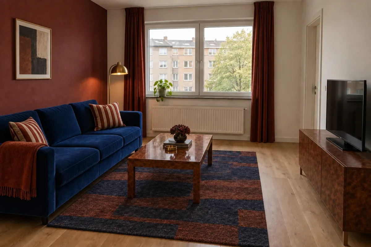
Yes—AI can use an inspiration photo to guide a redesign of your own room. Upload your room as the target image and the inspiration as the style reference. Then state which qualities should transfer, such as its palette, materials, textile pattern or lighting mood, while asking to preserve your room’s architecture and important furniture positions.
The goal is translation, not duplication. Your room image answers “where?” and the reference answers “what should it feel like?” A good result should still be recognizable as your space; it should not acquire the reference’s arched window, room proportions or exact furniture. This guide uses one ordinary apartment and one dramatically different boutique lounge to make those roles visible.
1. Give the two images different jobs
Treat your room as the source of spatial truth. Its camera view, walls, windows, doors, radiator, flooring and any furniture you plan to keep belong to the target image. The reference should influence the visual direction without replacing those conditions. Labeling the roles explicitly prevents a vague request to “combine” two rooms.
A reference can guide several layers at once, but you do not need to transfer all of them. Palette describes color relationships. Materials describe qualities such as velvet, burl wood or brushed brass. Mood may come from contrast and layered light. Furniture geometry, window shape and room layout usually belong to the reference scene itself and should stay there.
| Design input | Target room controls | Inspiration controls |
|---|---|---|
| Architecture | Walls, window, doorway, radiator and floor | Do not copy |
| Layout | Furniture positions, circulation and items to retain | May suggest relationships, not exact placement |
| Palette | Existing finishes that must remain | Colors and their balance |
| Materials | Surfaces you cannot or will not replace | Texture and finish direction |
| Mood | Real daylight and how the room is used | Contrast, warmth and visual emphasis |
2. Photograph the room you actually want to change
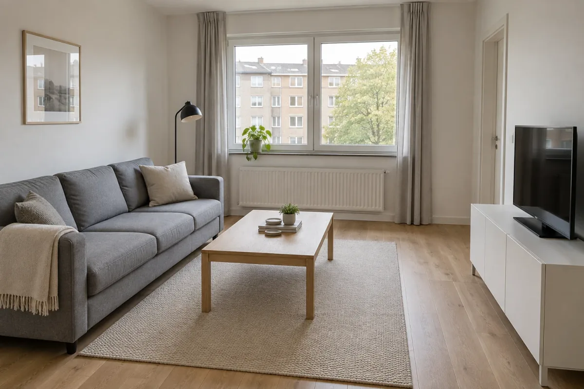
Choose a level photograph that shows at least two walls, the main opening and enough floor to read the furniture arrangement. Avoid panoramas and extreme wide-angle distortion. Keep fixed features visible, including a radiator or door that limits placement. If a sofa, table or television will stay, leave it in the image and name it in the instruction.
The target below is intentionally ordinary: off-white walls, a grey sofa, pale-oak table, cream rug and white media cabinet. Its two-panel window, rear radiator, right-hand doorway and current furniture positions are the anchors. A redesign can change upholstery and finishes, but it should not need a larger room or a new window to work.
3. Choose a reference with a readable idea
A useful inspiration image is easy to describe in one sentence. Look for a coherent palette, two or three legible materials and a mood that comes from more than a filter. A single room view is usually clearer than a collage containing several unrelated interiors. High enough resolution helps distinguish velvet from linen and timber from painted surfaces.
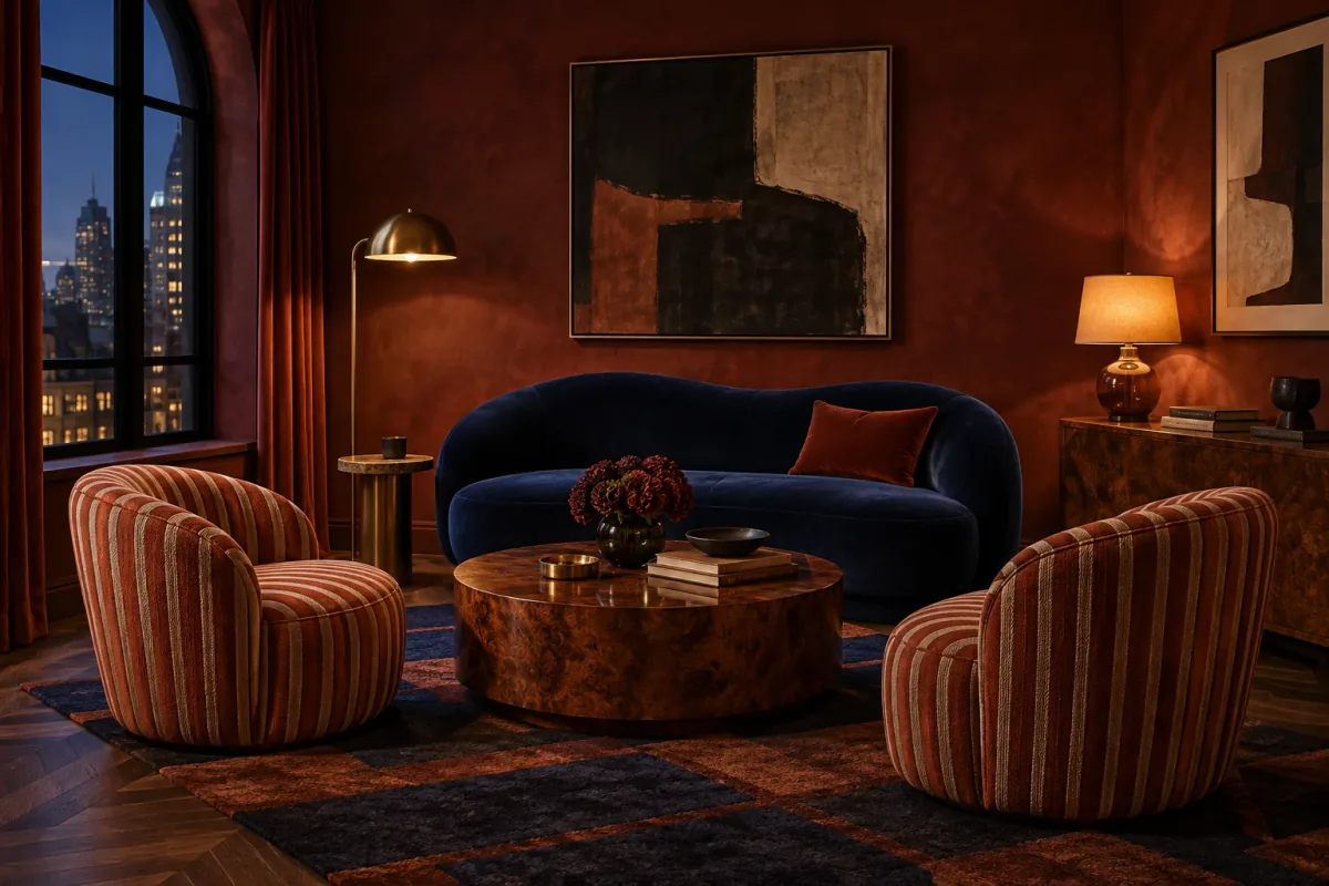
The room type does not have to match. Our reference is a boutique reading lounge with an arched window, oxblood limewash, cobalt velvet, rust-and-cream stripes, burl wood, brass and low evening light. Its architecture and chair arrangement are intentionally unlike the target apartment. That difference makes the task explicit: borrow the visual language, not the scene.
Use an image you own, are licensed to use or otherwise have permission to upload. Remove private information and avoid references containing identifiable people. If only one feature matters—perhaps the striped textile—say so instead of asking the model to infer your priority from every object in the image.
4. Turn “I like this” into transferable traits
Before generating, list what draws you to the reference without naming its objects first. In this example, the strongest ingredients are a cobalt–oxblood–rust palette, velvet beside striped woven textile, glossy burl wood, small brass highlights and a warmer layer of light. That list can be adapted to the sofa, rug, table, cabinet and lamp already present in the target.
Now list what should not transfer: the arched window, chevron floor, two lounge chairs, dark evening city and square room. This negative list is not a rejection of the reference; it protects the reason you supplied your room photo. Include target-room anchors again in the prompt so the intended hierarchy remains clear.
A quick reference-reading exercise
Write one line for each layer before composing the instruction.
- Palette: cobalt blue, muted oxblood, rust, deep navy and cream.
- Materials: velvet, striped woven textile, glossy burl wood and brushed brass.
- Mood: rich and warm, but adapted to daytime in the target room.
- Apply to: sofa, cushions, rug, table, cabinet, lamp and one wall.
- Do not copy: architecture, exact furniture, extra chairs or nighttime setting.
5. Explore a fuller translation of the reference
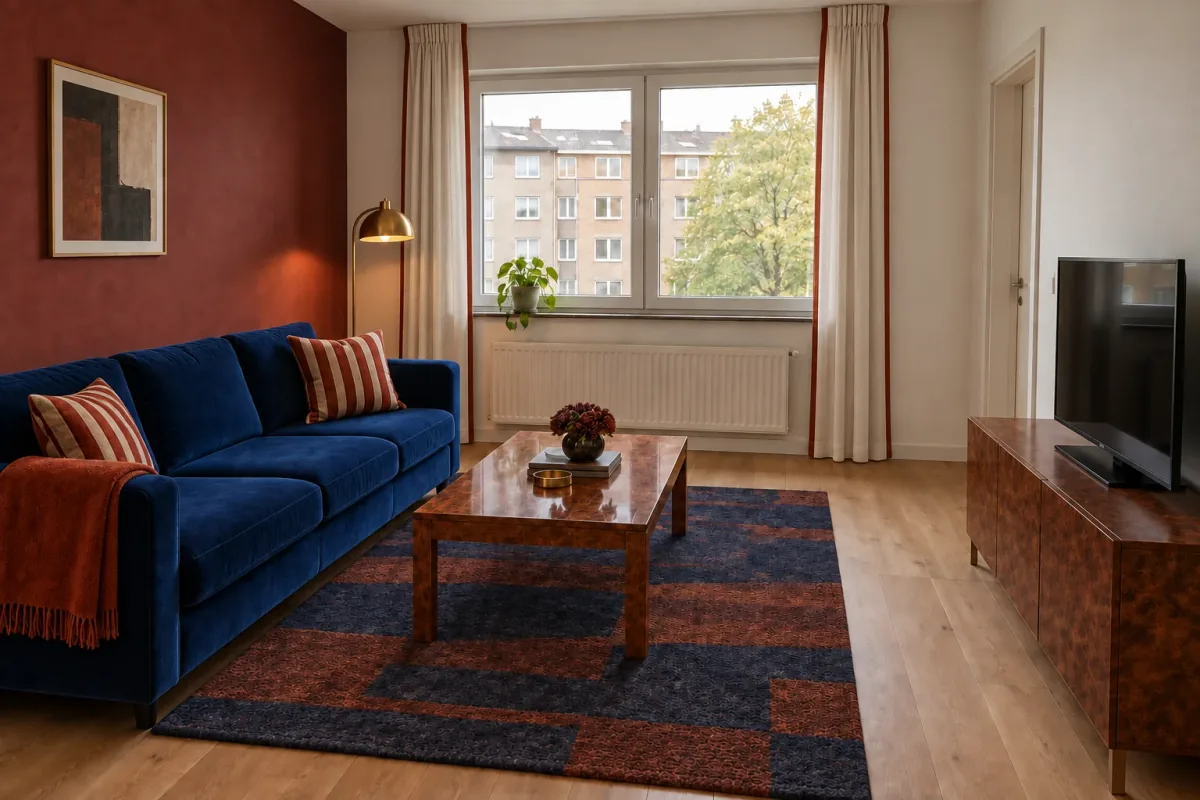
The fuller direction carries several linked traits into the apartment. The sofa becomes cobalt velvet, the table and media cabinet take on burl wood, the rug combines navy and rust, and striped cushions echo the reference chairs at a smaller scale. Muted oxblood is limited to the wall behind the sofa; the window wall and doorway wall remain light.
The target room is still identifiable. Its rectangular window, radiator, oak floor, doorway, television and furniture arrangement remain in place. The reference’s arched opening and extra chairs do not appear. This is the essential test: you should be able to point to both inputs and explain what each contributed.
The concept is intentionally richer than the starting room. If the rust curtains, wall and rug feel like too much repetition, that is a useful diagnosis. Keep the overall direction and identify one element to quiet rather than abandoning a palette that otherwise works.
6. Compare a lighter selection from the same reference
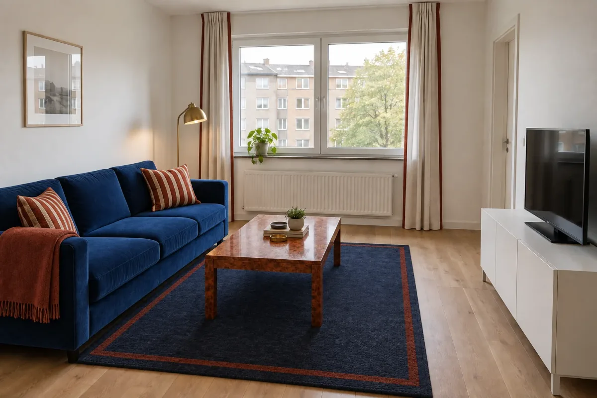
A second interpretation returns to the same two inputs but transfers fewer traits. The walls and white media cabinet stay unchanged. Cobalt moves to the sofa, burl wood to the table, brass to the lamp, and the striped reference appears only in cushions and a narrow curtain edge. The rug becomes deep navy with a restrained rust border rather than repeating the reference’s bold geometry.
This is not a different named style. It is a different answer to “which parts of the reference matter?” Compare it with the fuller version by ingredient: painted wall or light wall, burl cabinet or white cabinet, rust curtain or quiet linen, graphic rug or restrained rug. You can prefer the lighter transfer without deciding that the inspiration itself was wrong.
7. Check what came from each image
Review the target, reference and each output side by side. Start with the target-room anchors: window divisions, radiator, doorway, floor direction, sofa location, table footprint and media position. A result that quietly widens the wall or removes a constraint may look polished but does not demonstrate a successful translation.
Next, look for the reference traits you actually requested. Do cobalt and rust have a similar relationship? Is burl wood readable rather than becoming generic brown timber? Does brass remain an accent instead of appearing on every object? Finally, identify unrequested changes. Generative editing can reinterpret object shapes, lighting and decor even when the prompt asks for consistency.
Describe your choice in transferable terms: “keep the cobalt sofa and burl table, retain off-white walls, use a quieter navy rug.” This sentence is more useful than saying one image feels more like the reference. It becomes the brief for a focused next edit and eventually for real material samples.
8. Refine one element without reopening the whole style
Suppose the fuller translation has the right depth, but rust curtains make the window feel too heavy. Use that selected result as the new source and ask only for warm off-white linen curtains with a narrow rust edge. Name the wall, sofa, rug, wood, lamp, layout, camera and daylight as elements to retain.
The refinement below lightens the window while preserving the oxblood wall and the rug’s navy-and-rust palette. Compare it with its parent for incidental drift: the rug pattern changes visibly, while the artwork texture and exterior foliage shift more subtly. Even a narrow request can affect unrelated details. If a revision damages an important anchor, repeat it from the preferred parent rather than continuing from the compromised image.
9. Translate the image into real decisions
A generated sofa does not identify a purchasable product, and its apparent dimensions are not reliable. Measure the target room and any pieces you will retain. Then search for real upholstery, timber, rug and curtain options that perform the roles in your chosen concept. Verify clearance, comfort, delivery access, price and availability separately.
Collect physical samples for the dominant materials. View cobalt fabric, rust textile, wall paint, timber and rug together in your room’s daylight and evening lighting. Screen color and generated texture cannot confirm a product match. The concept is valuable because it tells you which relationships to test, not because its pixels are a specification.
Keep all three images in the final brief: the target records the starting conditions, the reference records the original attraction, and the selected result records the adaptation. Add a short note naming what must stay and what remains undecided. This makes the visual sequence useful to a designer, supplier or anyone helping with the next step.
Questions about redesigning from an inspiration photo
Which image should I upload first?
Use your own room as the target and clearly identify the second image as the style reference. The wording matters more than relying on an assumed order: state which image controls geometry and which supplies visual traits.
Do the two images need to show the same room type?
No. A lounge can guide a living room, bedroom or study if you name the transferable palette and materials. Do not ask to copy objects that make no sense for the target function.
Will AI copy the exact furniture from the reference?
Do not expect or request an exact product copy. Use the reference to describe form, material and color, then find real products separately and confirm their dimensions and availability.
Can I borrow only the color palette?
Yes. State that palette is the only reference role, name the colors you want to carry over and list your existing materials and furniture as unchanged.
What if the output copies the reference window or layout?
Reject that version and return to the target room with its openings, walls and furniture positions stated explicitly. Also name the reference architecture as something not to transfer.